


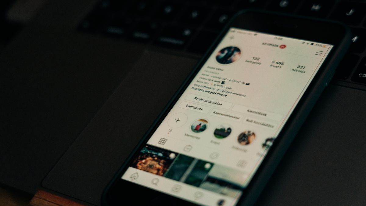
Your Instagram profile is often the first thing people see when they discover your account. In just a few seconds, visitors decide whether to follow you, explore your content, or move on. That’s why Instagram profile design tips matter so much. A well-designed profile creates a smooth, enjoyable experience that encourages people to stick around and engage with your posts.
Think of your profile as a digital storefront. The layout, colors, images, and text all work together to tell visitors who you are and what you offer. When these elements are thoughtfully arranged, people feel welcome and curious. When they’re messy or confusing, visitors leave without a second thought.
Good profile design isn’t about being fancy or following every trend. It’s about making smart choices that help people understand your content quickly and feel good about following you. Whether you’re building a personal brand, growing a business, or just sharing your hobbies, these Instagram profile design tips will help you create a profile that works harder for you.
Why Instagram Profile Design Matters for User Experience
User experience, often called UX, is all about how easy and pleasant it is for someone to interact with your profile. When visitors land on your page, they’re looking for answers. Who is this person? What kind of content do they share? Is this account worth following?
A well-designed profile answers these questions instantly. Your profile picture, bio, highlights, and grid all work together to create a clear picture of your brand or personality. When everything looks organized and intentional, visitors trust you more. They feel confident that following you will be a good decision.
On the other hand, a cluttered or confusing profile creates friction. If people can’t figure out what you’re about within a few seconds, they’ll simply scroll away. Remember that most users view profiles on mobile devices, so mobile responsiveness matters for how your profile displays. Everything needs to look good on a small screen.
First impressions happen fast. Your profile design shapes those impressions before visitors even read a single post. By paying attention to visual details and organization, you give yourself the best chance of turning casual visitors into loyal followers.
Choosing the Right Profile Picture

Your profile picture is the smallest but most important visual element on your page. It appears next to every comment you leave, every story you post, and every message you send. People will see this tiny circle hundreds of times, so it needs to be instantly recognizable.
For personal accounts, a clear headshot usually works best. Choose a photo where your face is well-lit and easy to see. Avoid busy backgrounds that distract from your features. The goal is for people to recognize you immediately, even at thumbnail size.
For brands and businesses, your logo often makes the most sense. Make sure it’s simple enough to read when shrunk down to a small circle. Complex logos with lots of text or fine details tend to look blurry and unprofessional at small sizes.
Consistency matters too. If you use the same profile picture across all your social media accounts, people can find and recognize you more easily. This builds trust and makes your brand feel more established. Learning how to create the perfect Instagram profile picture can make a real difference in how people perceive your account.
Consider the colors in your profile picture as well. Bright, contrasting colors tend to stand out in feeds and comment sections. If your photo blends into the background, it might get overlooked. A little pop of color can help you catch attention.
Writing a Bio That Connects with Visitors
Your bio is your chance to introduce yourself in 150 characters or less. That’s not much space, so every word needs to count. The best bios are clear, friendly, and tell visitors exactly what they can expect from your content.
Start by identifying what makes your account unique. Are you a travel photographer? A fitness coach? A small business selling handmade jewelry? Lead with this information so visitors immediately understand your focus. Avoid vague descriptions that could apply to anyone.
Use simple language that feels natural. Write like you’re talking to a friend, not drafting a formal resume. Emojis can help break up text and add personality, but don’t overdo it. A few well-placed emojis look fun; a wall of them looks chaotic.
The formatting of your bio affects readability too. Understanding typography helps you see how text formatting and font choices influence how easily people can read your words. Line breaks can make your bio easier to scan, especially on mobile. Instead of one long paragraph, try short phrases stacked vertically.
Don’t forget your call to action. What do you want visitors to do after reading your bio? Follow you? Click your link? Check out your latest post? A gentle nudge in the right direction can boost engagement. You might also want to explore how AI-generated captions and engagement relate to text choices that affect how people interact with your content.
Creating a Cohesive Visual Grid

When someone visits your profile, they see your most recent posts arranged in a grid. This grid is like a visual portfolio of your content. A cohesive grid looks intentional and professional, while a random-looking grid can feel disorganized.
Creating a cohesive grid doesn’t mean every photo needs to look the same. Instead, think about the overall feeling you want to create. Do you want your profile to feel bright and cheerful? Dark and moody? Colorful and playful? Once you decide on a direction, make choices that support that vision.
Color is one of the easiest ways to create cohesion. You might stick to a specific color palette, using the same few colors throughout your posts. Some creators love the black and white aesthetic for a timeless, elegant look. Others prefer warm tones or cool blues. Whatever you choose, consistency helps your grid feel unified.
Composition matters too. Pay attention to how images are framed and where the main subject appears. When you crop images for Instagram, you can maintain grid consistency by ensuring each photo fits well with its neighbors. Proper cropping helps your posts look intentional rather than haphazard.
Planning ahead makes a big difference. Before posting, preview how a new image will look alongside your existing content. Many creators use planning apps to arrange their grid before publishing. This extra step helps you catch clashing colors or awkward compositions before they go live.
Remember that your grid tells a story at a glance. When all your posts work together visually, visitors get a stronger sense of your style and content. This makes them more likely to follow and engage.
Using Quality Images to Improve Your Profile
Image quality can make or break your Instagram presence. Blurry, poorly lit, or pixelated photos look unprofessional and can drive visitors away. On the other hand, crisp, well-composed images draw people in and make them want to see more.
You don’t need expensive camera equipment to take good photos. Modern smartphones have excellent cameras that can produce stunning images. The key is paying attention to lighting, composition, and focus. Natural light usually works best, especially during the golden hour just after sunrise or before sunset.
Editing can elevate your photos from good to great. Simple adjustments to brightness, contrast, and saturation can make colors pop and details stand out. Many creators enjoy experimenting with Instagram face filters and other tools to enhance their visual appeal and add creative touches to their content.
Sometimes you need images you can’t easily capture yourself. Maybe you’re creating content about topics that require specific visuals, or you want professional-looking graphics for your posts. In these cases, stock photos can be a helpful resource for finding quality images when you need professional visuals. Just make sure any images you use fit your brand and feel authentic to your content.
Consistency in image quality matters as much as consistency in style. If some of your posts look polished while others look rushed, your grid will feel uneven. Take time with each image to ensure it meets your standards before posting.
Designing Highlights That Guide Visitors

Story highlights are the circles that appear below your bio. They let you save and organize your best stories so visitors can explore them anytime. Well-designed highlights act like a menu, helping people find the content they’re most interested in.
Start by thinking about what categories make sense for your content. A food blogger might have highlights for recipes, restaurant reviews, and cooking tips. A fitness coach might organize by workout types, nutrition advice, and client transformations. Choose categories that reflect what your audience cares about most.
The covers of your highlights matter more than you might think. Custom covers create a polished, professional look that matches your overall aesthetic. Calm visuals in highlight covers can create a relaxing, inviting profile atmosphere that makes visitors feel comfortable exploring your content.
Keep your highlight titles short and clear. You only have a few characters visible before the text gets cut off, so choose words that communicate quickly. Icons or emojis in your covers can help visitors understand each category at a glance.
Think about the order of your highlights too. The most important or popular categories should come first, since those are what visitors see without scrolling. You can rearrange highlights anytime by adding a new story to the one you want to move forward. Visual elements like highlight covers contribute to your overall aesthetic, and you can learn more about ways to boost your Instagram aesthetic through thoughtful design choices.
Regularly update your highlights to keep them fresh and relevant. Remove outdated content and add new stories that showcase your best recent work. Active, well-maintained highlights show visitors that your account is current and worth following.
Profile Design Tips for Business Accounts

Business accounts have some unique considerations when it comes to profile design. Your profile needs to build trust, communicate professionalism, and encourage visitors to take action, whether that’s making a purchase, booking a service, or visiting your website.
Your profile picture should clearly represent your brand. For most businesses, this means using your logo. Make sure it’s high quality and recognizable at small sizes. If your logo doesn’t work well in a circle, consider creating a simplified version specifically for social media.
Your bio should quickly communicate what you offer and who you serve. Include relevant keywords that help people understand your business at a glance. If you’re a service-based business, you may have different profile design needs than product-based accounts. Service businesses often benefit from highlighting their expertise and the results they deliver, while product businesses might focus more on showcasing their offerings.
Take advantage of business-specific features like contact buttons and category labels. These make it easy for potential customers to reach you or understand what type of business you run. The easier you make it for people to connect with you, the more likely they are to do so.
Consider how your Instagram profile connects with your broader online presence. Many businesses benefit from website design that leverages Instagram to create a seamless experience across platforms. When your website and Instagram profile share consistent branding, visitors feel confident they’re in the right place.
Use your highlights strategically to showcase products, services, testimonials, and frequently asked questions. This helps potential customers find the information they need without having to message you directly. Think of highlights as a mini-website within your Instagram profile.
Simple Ways to Boost Engagement Through Design
Good design doesn’t just look nice—it encourages people to interact with your content. When your profile is well-organized and visually appealing, visitors are more likely to like, comment, share, and save your posts.
One simple way to boost engagement is through visual consistency. When your grid looks cohesive, people spend more time exploring your content. They scroll through your posts, tapping on images that catch their eye. The longer someone stays on your profile, the more likely they are to engage.
Your bio can also drive engagement. Include a clear call to action that tells visitors what to do next. Phrases like “Check out my latest post” or “Tap the link for more” give people direction. Without guidance, many visitors simply browse and leave without taking action.
Highlights can encourage engagement too. Create highlights that invite interaction, like Q&A sessions, polls, or behind-the-scenes content. When people see that you’re active and responsive, they’re more likely to engage with your stories and posts.
Think about the types of content that naturally encourage interaction. Posts with questions, fill-in-the-blank prompts, or controversial opinions tend to generate more comments. Carousel posts that tell a story encourage people to swipe through. Reels that entertain or educate get shared more often. Understanding how to increase Instagram engagement through better design and content choices can transform your results over time.
Pay attention to what’s working. Instagram provides insights that show which posts get the most engagement. Look for patterns in your top-performing content. Are certain colors, topics, or formats more popular? Use this information to guide your future design choices.
Don’t forget about accessibility. Use alt text for your images so people using screen readers can understand your content. Choose fonts and colors with good contrast so your text is easy to read. When your content is accessible to more people, you naturally reach a larger audience.
Finally, remember that engagement is a two-way street. Respond to comments, answer questions, and show appreciation for your followers. When people feel seen and valued, they’re more likely to keep engaging with your content. Good design gets people to your profile, but genuine connection keeps them coming back.
Implementing these Instagram profile design tips takes time and attention, but the results are worth it. A thoughtfully designed profile creates a better experience for everyone who visits. It helps you stand out in a crowded space and builds the foundation for meaningful engagement with your audience. Start with one or two changes, see how they feel, and keep refining until your profile truly represents who you are and what you offer.
